Why Some Bedding Sets Look Luxurious Online But Feel Thin In Person
Some bedding sets look plush online but feel thin at home. Clever lighting, styling and vague fabric details can exaggerate quality. Here’s why the difference happens and what shoppers should check before buying.

How to choose bedsheets that look as good in reality as they do online
Shopping for bedding online should feel simple. Pick a colour, admire the photograph, check the price and wait for a neatly packed parcel to arrive. Yet the experience often takes an awkward turn when the package is opened. The rich, layered bedding shown online may appear soft, weighty and beautifully textured. In person, the same set can feel thin enough to reveal the print on the mattress underneath. The elegant folds seen in the product photograph may disappear after one wash, leaving fabric that looks less palace suite and more spare-room emergency.
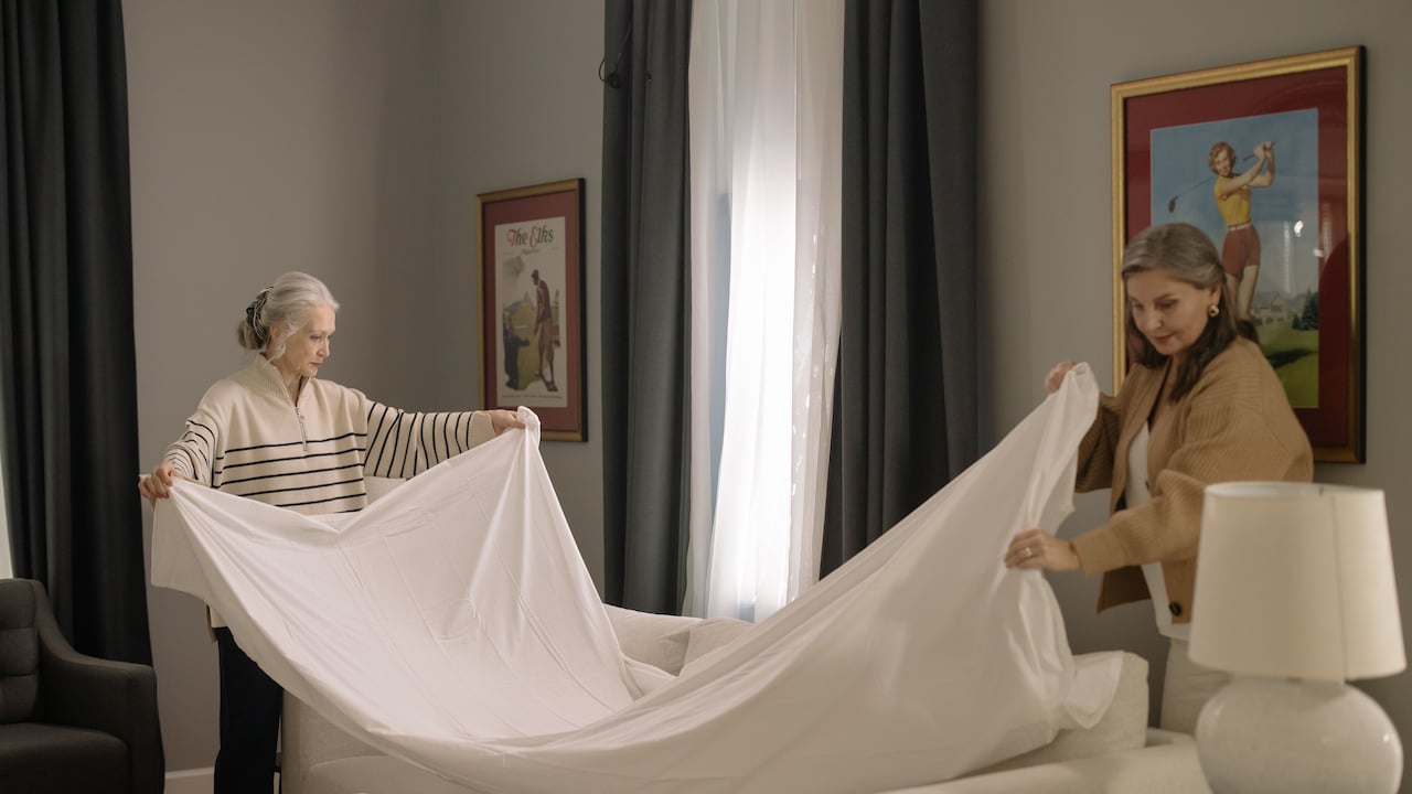
Common reasons why some bedsheets look more luxurious online than in reality
Photo Credit: Pexels
This difference does not always mean the seller has acted dishonestly. Several factors shape how bedding appears on a screen. Cameras enhance texture, styling adds volume and product descriptions may focus on attractive words rather than useful details. Even personal expectations play a role.
Also Read: 5 Best Bedsheets Under ₹1,000 That Look Luxe Without the Price Tag
A little knowledge can prevent disappointment. It can also make it easier to spot bedding that offers genuine comfort rather than online glamour alone.
What Makes Online Bedding Look More Luxurious Than It Feels
Product Photography Creates An Illusion Of Depth
Online bedding photographs rarely show a set exactly as it would appear after being unpacked at home. Professional photographers use light, shadow and careful angles to make fabric look deeper, fuller and more textured.
Soft side lighting can exaggerate tiny folds, giving a flat bedsheet the appearance of thick woven fabric. Close-up shots may highlight raised patterns while hiding the overall weight of the material. Bright colours also tend to appear richer under studio lights than they do beneath a bedroom tube light.
The bed itself adds to the illusion. Product stylists often use thick duvets, extra pillows and hidden padding beneath the sheet. The bedding may only form the outer layer, but everything underneath makes it look generously cushioned.
At home, the same set may be placed over a slim mattress with two everyday pillows. Naturally, it looks flatter.
A photograph sells a mood rather than a laboratory measurement. That romantic image of a perfectly dressed room may be useful for inspiration, but it should not serve as proof of fabric thickness.
Styling Tricks Make Fabric Look Heavier
A beautifully styled bed can persuade the eye that the fabric is more substantial than it really is. Deep folds, rolled corners and loosely arranged layers create visual weight, even when the material itself is light.
Stylists often tuck sections of fabric beneath the mattress to create tension across the bed. They may gather the remaining cloth into soft waves around the edges. This gives the impression that the set contains plenty of fabric and falls gracefully.
In reality, lightweight bedding can be made to look expensive through skilled arrangement. A thin sheet draped over a thick comforter will borrow its shape and volume. Decorative cushions can also distract from the plainness of the main fabric.
This is similar to how a modest plate of biryani can look lavish when served in a polished copper handi with fried onions scattered on top. Presentation changes perception.
Most homes do not have a stylist arranging the bed each morning. Once the sheet is spread normally, its true structure becomes obvious. What looked plush online may appear flat, delicate and rather ordinary.
Fabric Weight Is Often Missing From Descriptions
One of the biggest reasons for disappointment is the lack of clear information about fabric weight. Many product pages mention colour, print and thread count but say little about how dense or substantial the material feels.
Fabric weight is often measured in grams per square metre, commonly written as GSM. A higher GSM usually suggests a denser fabric, though the ideal number depends on the material and weave. Without this detail, buyers must rely on photographs and vague phrases such as “premium quality” or “luxury finish”.
Those words sound impressive, but they have no fixed meaning. A “lightweight luxury bedsheet” may be perfectly suitable for hot weather, yet it will not provide the weighty feel suggested by the photographs.
Some shoppers only discover this after paying ₹1,499 for a set that feels little different from a basic ₹599 option.
A reliable listing should explain the fabric composition, weave, weight and expected feel. When these details are missing, caution helps. Attractive adjectives cannot replace measurable information, especially when touch matters as much as appearance.
Thread Count Can Be Misleading
Thread count often receives star treatment in bedding advertisements. A high number sounds luxurious, scientific and reassuring. Yet it does not always reveal how thick, soft or durable a bedsheet will feel.
Thread count refers to the number of threads woven into a square inch of fabric. However, manufacturers may count individual strands within twisted yarns to produce a larger figure. This means a sheet labelled with an extremely high thread count may not feel as rich as expected.
The quality of the cotton, the type of yarn and the weaving method matter just as much. A well-made lower thread count sheet can feel smoother and stronger than a poorly made sheet carrying a dramatic number on its packaging.
Some synthetic fabrics also display high thread counts while remaining light and slippery.
The number should therefore act as one clue, not the final verdict. Shoppers should also check the fibre type, weave and fabric weight. A believable description offers a balanced picture. One giant number printed in gold lettering may simply be marketing wearers of a silk dressing gown.
Digital Editing Makes Colours And Textures Richer
Product images often receive careful editing before appearing online. Brightness, contrast, sharpness and colour saturation may all be adjusted to make bedding more appealing.
A muted maroon can become a rich wine shade. A faint woven pattern can appear bold and tactile. Even plain fabric may gain visual depth when shadows are strengthened, and highlights are polished.
Screens add another layer of uncertainty. Colours differ between phones, laptops and tablets. A bedsheet that looks warm beige on one screen may appear pale grey on another. Display settings, screen brightness and even night mode can alter the final impression.
Texture suffers from the same problem. A camera can capture the appearance of softness, but it cannot communicate how the fabric feels against the skin. Smooth-looking material may feel stiff, slippery or paper-thin.
This gap becomes especially noticeable when shoppers expect a festive, rich finish for a newly decorated room. The parcel arrives, the colour looks weaker, and the fabric lacks presence.
Digital images can guide a purchase, but they cannot replace touch. That remains the greatest limitation of online bedding shopping.
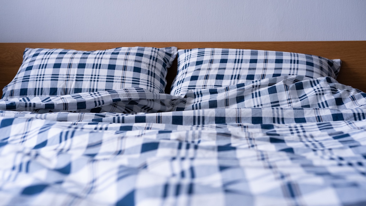
Digital editing can also make the bedsheet look better online
Photo Credit: Pexels
Synthetic Blends Can Look Rich But Feel Light
Synthetic and blended fabrics often photograph extremely well. Polyester fibres hold colour strongly, resist wrinkles and produce a smooth surface. Under studio lighting, they can appear polished, vibrant and expensive.
Yet the physical experience may feel very different. Some synthetic blends are thin, slippery or less breathable than cotton. They may also cling to the body during warm nights, especially in cities where summer seems determined to stay for eleven months.
This does not make every synthetic blend unsuitable. Many are affordable, easy to wash and practical for guest rooms or occasional use. The problem arises when glossy photographs create the expectation of thick, hotel-style bedding.
Fabric composition deserves close attention. A listing that mentions “cotton feel” may not contain much cotton at all. Phrases such as “silk touch” or “satin finish” describe an effect, not necessarily the fibre.
A product can look luxurious because it reflects light beautifully while still feeling light in the hand. The shine attracts attention, but comfort depends on more than shine. Breathability, density and skin feel matter once bedtime arrives.
Sample Beds Are Usually Overfilled
The bed used in a product shoot is rarely an average household bed. It is usually prepared to look exceptionally full, soft and inviting.
Thick mattress toppers create a rounded surface. Large duvets are folded beneath the visible bedding. Extra pillows may be placed inside pillowcases to stretch the fabric and make it appear crisp. Sometimes clips and pins hold the material in perfect positions outside the camera frame.
These details create a generous silhouette. The bedding seems to fall heavily over the sides, even when the fabric itself contributes very little volume.
At home, the same set may be spread across a firm mattress without a topper. The pillowcases may hold regular pillows rather than oversized inserts. The result looks less dramatic.
This is not unlike seeing a kurta displayed on a carefully shaped mannequin and then noticing that it falls differently during normal wear. The product has not necessarily changed; the setting has.
Shoppers should study flat product images, packaging photographs and customer uploads whenever available. These often reveal the bedding more honestly than a perfectly staged bedroom scene.
Close-Up Images Hide Overall Thinness
A close-up photograph can make almost any fabric look impressive. Fine stitching, printed details and tiny surface patterns appear rich when enlarged across a screen.
The problem is that close-ups remove scale. A viewer may see an attractive texture without understanding how lightweight the full sheet is. The image shows design quality but not density.
Sellers often include several detailed photographs because they create confidence. A visible weave suggests craftsmanship. Neat hems suggest durability. Yet neither proves that the fabric has enough body.
The full-bed image may also be taken from a distance, where thinness becomes difficult to notice. When both techniques appear together, the mind fills in the missing information and imagines a thicker product.
A useful approach is to look for photographs where the fabric is held up, folded several times or shown against natural light. Customer images can also reveal whether the sheet appears transparent.
A bedsheet should not need detective work, but a few careful observations can save money. When every image focuses on embroidery and print while avoiding the fabric's edge or underside, the missing views may matter most.
Packaging And Finishing Temporarily Improve The Feel
New bedding often receives treatments that make it feel smoother and firmer inside the package. Starch, finishing agents and tight folding can give lightweight fabric temporary structure.
The set may feel crisp when first opened. After washing, that crispness can disappear, revealing softer but thinner material underneath. Colours may also lose some intensity, and the fabric may stop holding the sharp folds shown in the product images.
This does not always indicate poor quality. Many fabrics change after the first wash. However, the product page should ideally explain what buyers can expect.
Packaging creates its own psychological effect. A set placed in a rigid box with a glossy label feels more luxurious than the same fabric wrapped in a simple plastic cover. Attractive branding encourages the mind to associate presentation with substance.
A ₹2,000 bedding set packed like a wedding gift may therefore seem superior before it even touches the mattress.
The real test begins after regular use. Good bedding should remain comfortable, retain its shape and survive repeated washing. A polished first impression matters less than dependable performance over several months.
Reviews Often Focus On Looks Rather Than Feel
Customer reviews can be helpful, but they do not always answer the most important questions. Many buyers post feedback immediately after opening the parcel. They comment on colour, print and delivery rather than fabric density or long-term comfort.
A review saying “beautiful bedsheet, worth buying” may reflect genuine satisfaction, yet it gives little information about thickness. Another buyer may prefer lightweight bedding and consider the same fabric perfect.
Photographs in reviews also vary in quality. Bright daylight can make colours look better, while dim rooms can make them appear dull. Some reviewers spread the sheet over thick blankets, repeating the same visual illusion seen in professional photographs.
The most useful reviews mention washing, transparency, softness, stitching and fit. Comments written after several weeks carry more value than first-day excitement.
It also helps to read a mixture of positive, neutral and negative feedback. Extreme reviews can be emotional. The balanced ones often reveal the truth.
A product with thousands of stars may still feel wrong for a particular home. Reviews show other people's experiences, not a universal verdict. Personal preferences and local weather conditions remain important.
Price And Brand Names Raise Expectations
Price strongly shapes expectation. When a bedding set costs ₹3,500 rather than ₹800, shoppers naturally expect thicker fabric, better finishing and a richer feel.
Yet higher prices may reflect branding, design, packaging, advertising or licensing rather than fabric weight. A fashionable print or famous label can increase the cost without making the material more substantial.
The word “luxury” also carries emotional power. It suggests softness, abundance and hotel-like comfort. Once that word appears in a listing, the mind creates a complete sensory picture before the parcel arrives.
This can make disappointment sharper. A reasonably priced lightweight set may feel acceptable, while an expensive one with the same weight feels like a betrayal.
The best approach is to separate price from performance. Check the specifications before admiring the brand story. Look for details about material, weave, dimensions, care and weight.
Luxury should describe the experience, not merely the packaging. A quiet night on breathable, well-made cotton can feel far more indulgent than sleeping under a glossy set that looks magnificent but feels like decorative wrapping paper.
Products Related To This Article
1. JC HOME Yellow Solid Polycotton 4 Piece Double Extra Large Regular Bedding Set
2. KOPA White & Blue Geometric Other 4 Piece Double King Regular Bedding Set
3. DDecor Yellow 4 Piece Double King Geometric Cotton Bedding Set
4. SANSAAR A DDECOR BRAND LIVE CONSCIOUSLY Blue Self Design Cotton 3 Piece Double King Superfine Bedding Set
5. BREVARD 3 Pieces Floral Cotton Double King Superfine Bedding Sets
6. Aura Blue & White Geometric Printed Cotton 210 GSM Double Queen Bedding Set
7. Stoa Paris Ethnic Motifs Other 9 Piece Double Extra Large Bedding Set
The gap between online appearance and real-world feel comes from many small influences. Lighting adds depth, styling creates volume, editing strengthens colour and vague descriptions leave room for imagination.
Bedding also remains difficult to judge through a screen because comfort depends on touch. No photograph can fully communicate weight, breathability, softness or how the fabric changes after washing.
A careful shopper can still make a confident choice. Fabric composition, GSM, weave, customer photographs and detailed reviews reveal more than dramatic lifestyle images. Reasonable expectations also help. Lightweight bedding may be ideal for warm weather, provided it is sold honestly and chosen intentionally.
The goal is not to avoid beautiful product photographs. Those images can inspire colour schemes and bedroom ideas. They simply need to be viewed with a little healthy suspicion.
A luxurious bed does not depend on clever lighting or ten decorative cushions. It depends on fabric that feels pleasant at the end of a long day. When the appearance and experience match, even a simple bedding set can make a bedroom feel wonderfully complete.
(Disclaimer: This article may include references to or features of products and services made available through affiliate marketing campaigns. NDTV Convergence Limited (“NDTV”) strives to maintain editorial independence while participating in such campaigns. NDTV does not assume responsibility for the performance or claims of any featured products or services.)